Category Archives: History

Two Letters on a Ring

An old Kodak came in with its back jammed shut. When we finally forced it open, there was something hidden inside — and no one will ever know who put it there.

By Leslie Gordon · Richmond, BC · October 2026
From the counter at The Pound & The Provenance

It started with a camera that wouldn’t open. A No. 3 Folding Pocket Kodak, Model H — Rochester, New York, somewhere around 1911 to 1915 — the handsome old folding kind, with black leather over the body and deep red bellows that pleat out like an accordion. A proper hundred-year-old camera. And its back was stuck.
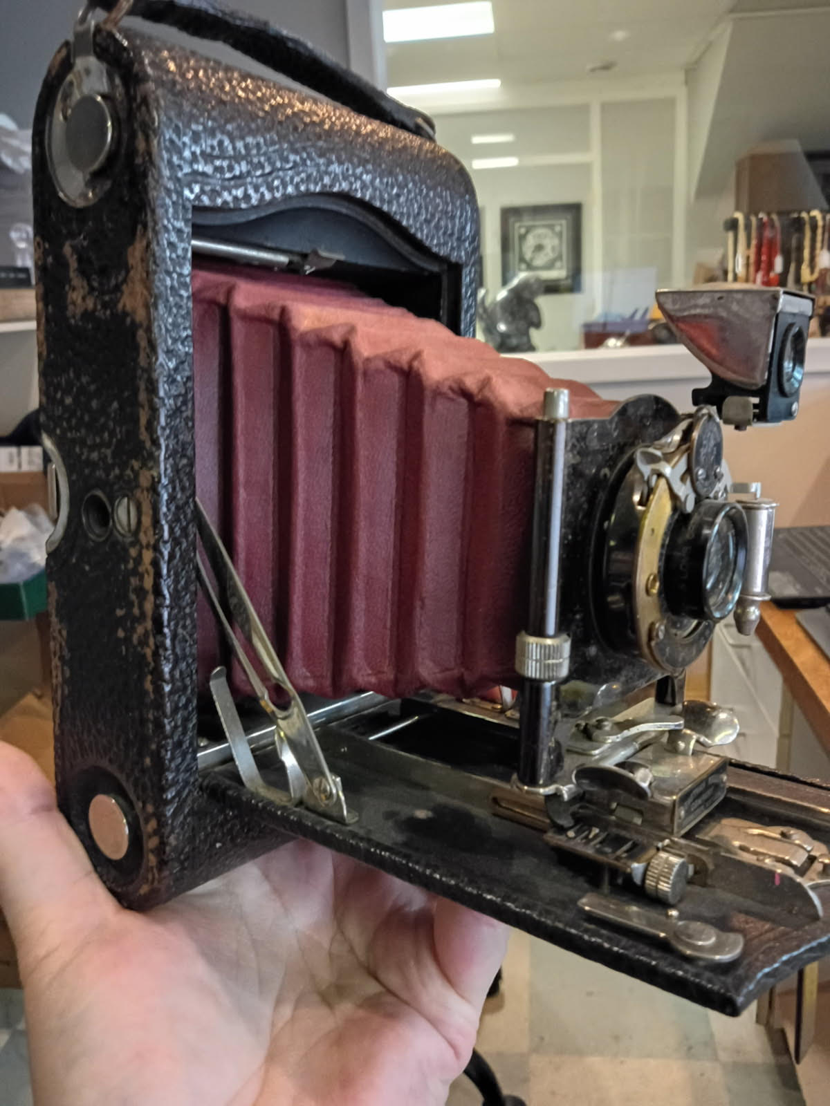
Not sticky. Stuck. The back panel, the part that comes off to load the film, was pushed partway out and would not move. It wouldn’t come out the rest of the way. It wouldn’t go back in. I’ve opened a great many old cameras and I had never felt one fight like this. Something was wedged in there.

When we finally got it open — and it took some doing — this is what was waiting inside the film chamber: a little wooden case, wrapped up in a dark red man’s handkerchief. Someone had hidden it in there deliberately, pushed the back cover of it to close it, and the two had been locked together so long and so tight that the camera had all but sealed itself shut around its secret.

Inside the little wooden case was a ring.

What the ring was

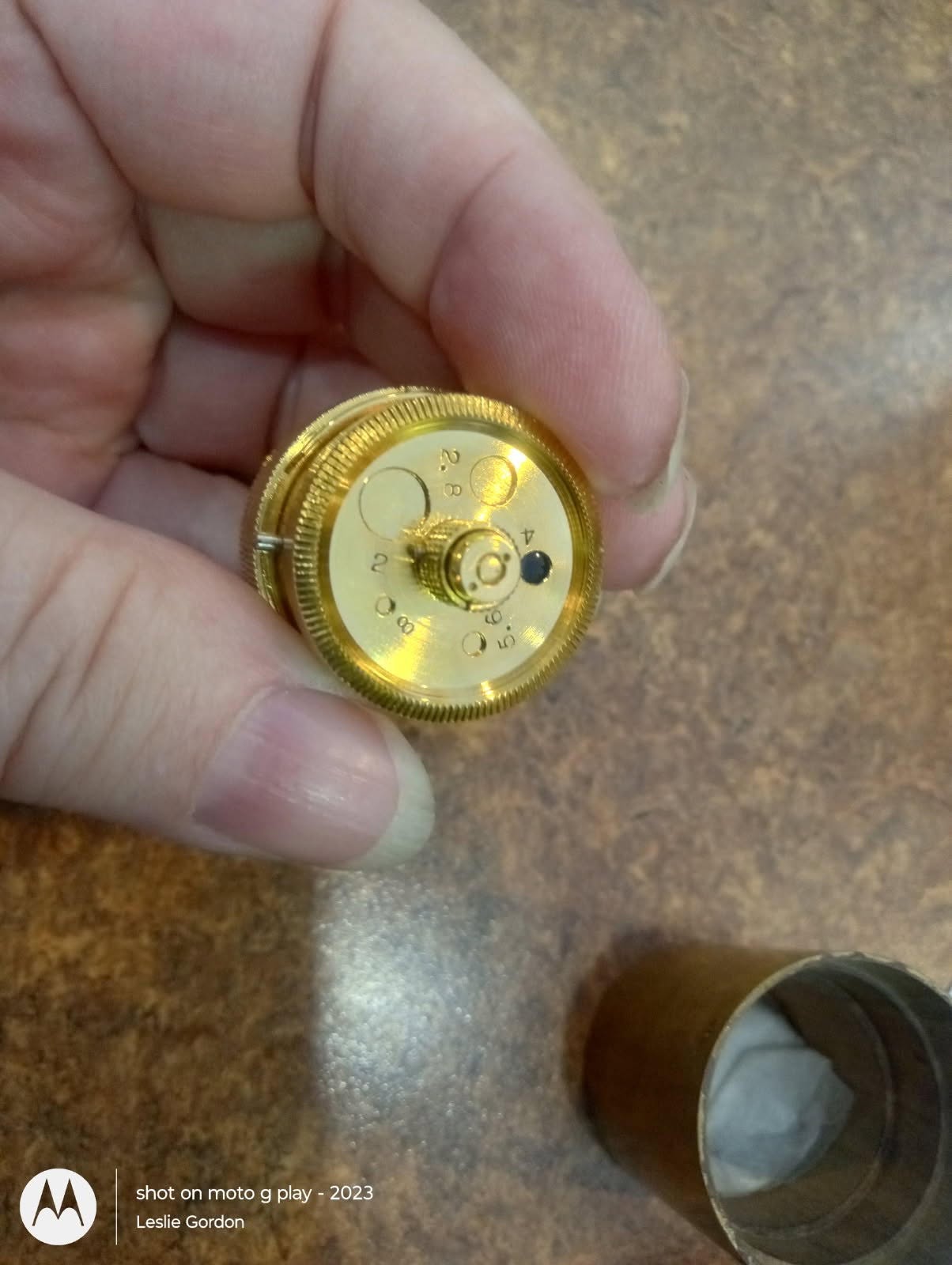
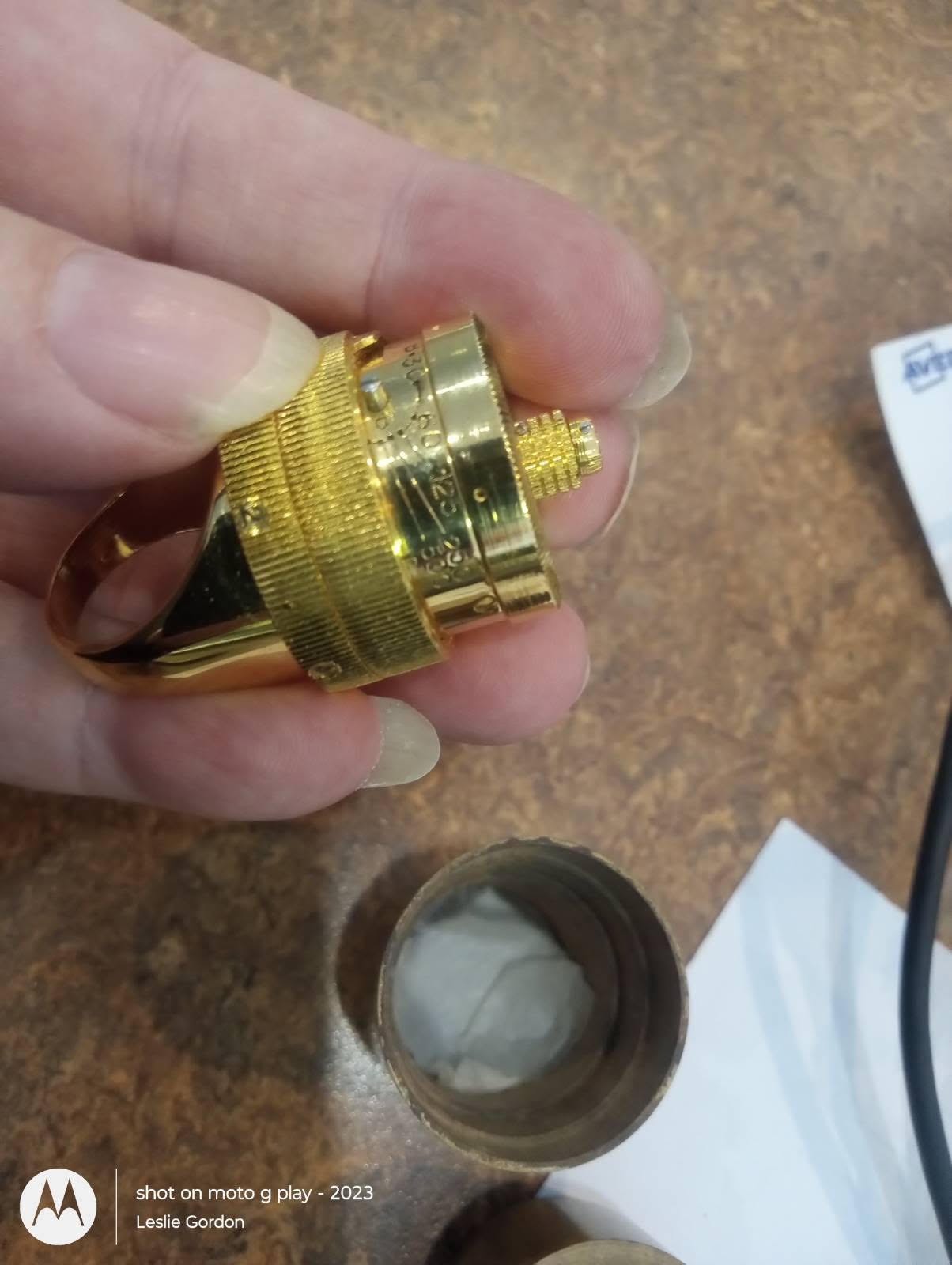
It looked, at first, like a heavy novelty ring. Gold, chunky, a little strange. But turn it over and there were numbers and dials worked right into the band — tiny aperture stops, shutter speeds. Not a ring pretending to be interesting. A real, working subminiature camera, built to be worn on a finger. A camera, in other words, hidden inside another camera.
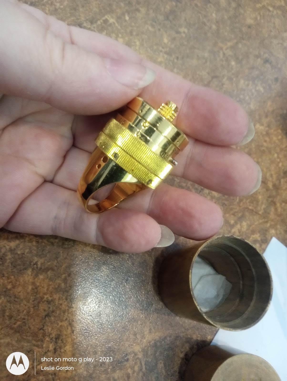
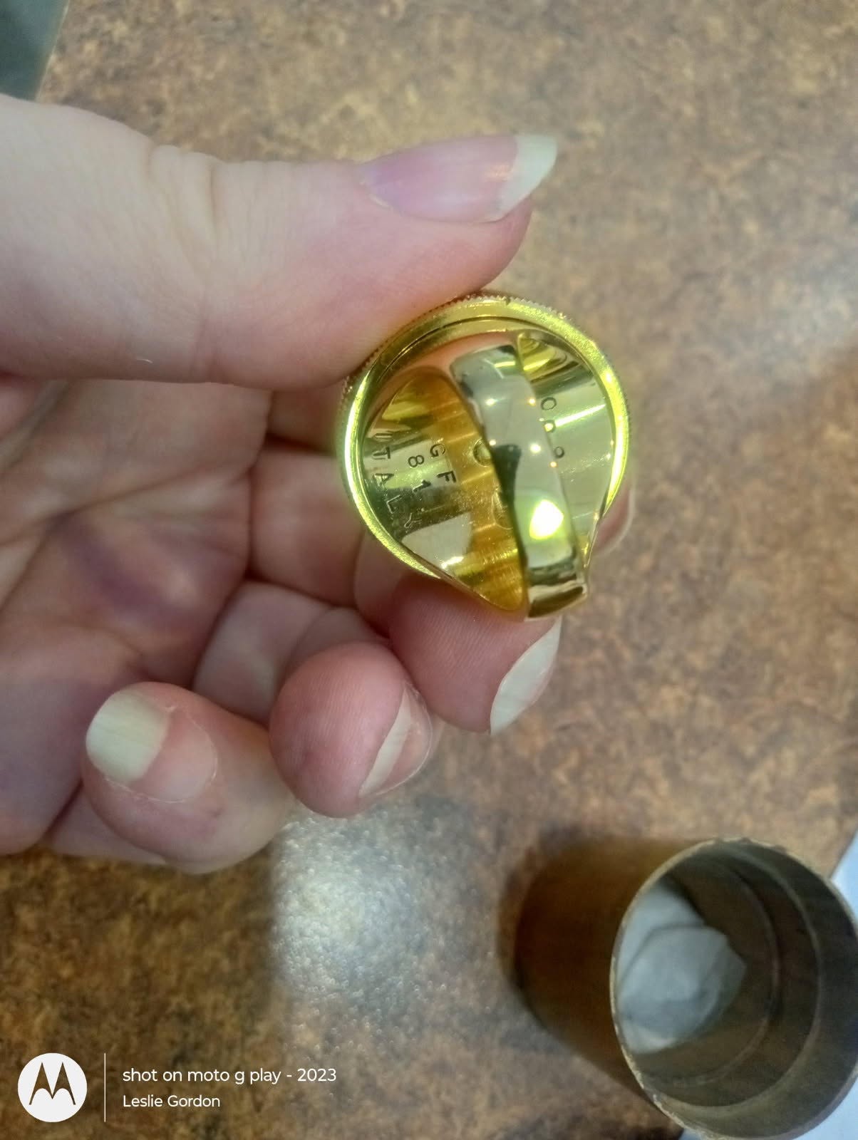
What it did not have was a name. No tidy maker’s plaque, no note tucked in with it to say who or why. Just a mark cut into the band and the storage cylinder:

GF 81 ITALY Maker’s initials · Year · Country

Two letters, a year, a country. That’s the whole of what the ring would tell me outright. GF for whoever made it. 81 for 1981. ITALY for where. And a number — this one is 9 of 20 — meaning it belonged to a numbered edition, something made in a deliberately small run rather than by the thousand.

Which already raised a quiet little problem. The camera it was hidden inside is from about 1911. The ring is from 1981. Seventy years apart. Whoever did the hiding did it in my lifetime, not in some sepia past — chose an antique camera, three generations old even then, as the place to tuck something away. I find I can’t stop thinking about that, and I have no way to know the rest of it.

The hunch

Here is the part I’ll be honest about, because honesty is the whole job. I had a feeling about those two letters. Not evidence — a feeling, the kind you get after enough years of handling things. I was fairly sure GF stood for a particular maker. But a feeling is not something you can put on a tag or tell a buyer. In this trade, “I know it in my heart” and “I can prove it” are two different objects, and only one of them is worth money.
So the rule I hold to is simple: follow the marks until they either confirm the hunch or kill it. The marks are allowed to lead. The hunch is not.

The marks led somewhere.

What the marks confirmed

It turns out there is a documented record for exactly this object. The first ring camera of its kind was made in Italy in 1981, in an edition of just twenty pieces, gold-plated and numbered 001 through 020. The two letters cut into the band are the initials of the man who made it: Gianpaolo Ferro.

Everything on the ring lines up with that record — the GF, the 81, the Italy, the number inside a run of twenty. The hunch and the documentation arrived at the same door at the same time. That’s the moment a feeling becomes a fact you’re allowed to say out loud.

Ferro went on to make other versions over the following years, but only ever 107 of these ring cameras across his whole career, start to finish. Twenty of them were that first 1981 batch. This is one of those twenty.
What the ring is

Maker Gianpaolo Ferro, Italy ModelGF81 ring camera Year1981 EditionNo. 9 of 20 Finish Gold-plated Function Working subminiature camera — real aperture & shutter settings

Why a camera in a ring

The idea isn’t as far-fetched as it sounds. For most of the twentieth century, if you needed to photograph something and could not be seen doing it, the camera had to disappear. It went inside matchboxes, cigarette cases, pocket watches, wristwatches — and, yes, gold rings. The whole craft was making the machine vanish into an ordinary object.

So a camera worn on a finger belongs, at least in spirit, in a Cold War spy story. I want to be careful with that, the way I’d want any dealer to be careful with me: I can’t tell you this particular ring was ever carried by an agent or used in the field. What I can tell you is what it is — a genuine, working, finger-worn camera from 1981 — and let the imagination do the rest.
What we’ll never know

Here is the part I can’t answer, and won’t pretend to. I don’t know who hid the ring inside that camera. I don’t know why. I don’t know whether it was squirrelled away from a thief, a spouse, a government, or simply from the ordinary forgetfulness of a crowded drawer. I don’t know whose dark red handkerchief that was, or whether the person who wrapped it meant to come back for it and never did.

And I’ve decided I’m glad I don’t. A dealer is always tempted to tidy a story up — to supply the ending the object seems to be asking for. But the honest version is better than any I could invent: a working spy camera, sealed for who-knows-how-long inside a hundred-year-old Kodak, wrapped in a stranger’s handkerchief, and no one left to tell us the rest. The mystery is the inheritance. I’m the one who happened to open the box.

What I can say, I’ve said plainly — and every word of it is first-hand. The camera that wouldn’t open. The forcing of it. The little wooden case and the red handkerchief. And two letters that, followed patiently, turned out to name a man and a year. If I’d shelved the ring as a novelty, GF would have stayed GF (and meant gold-filled). The whole difference between “odd gold ring” and “documented 1981 Ferro, nine of twenty” was treating a small thing as a question worth asking.

That’s the quiet pleasure of this work. The thing in your hand is always trying to tell you what it is. Most days it manages only a word or two. My job is to take the word or two seriously enough to find out what it was trying to say — and to know when to stop, and let the rest stay a mystery.

Going to auction…

This one is at Harrington’s

Not ours to sell this time — the ring is consigned to Harrington’s Fine Jewellery Auction, and it goes to the block with its little wooden case.

Lot 92, closing Friday, October 16.

Phone 1-800-359-9021
bid.harringtonsauctions.com — search “spy camera ring,” Lot 92

A spy camera that turned out to be real — hiding, all along, behind two little letters.

Leslie · The Pound & the Provenance · 778-708-0454
The Lady on the Gentlemen’s Shelf

There is a case in the back of my shop that most people never see. The room it lives in is only half finished, so I keep the door shut and take folks in myself — which means by the time someone is standing in front of that case, we both know they are a serious person. The repeat offenders, I call them. You know the type. You are the type, or you wouldn’t still be reading.

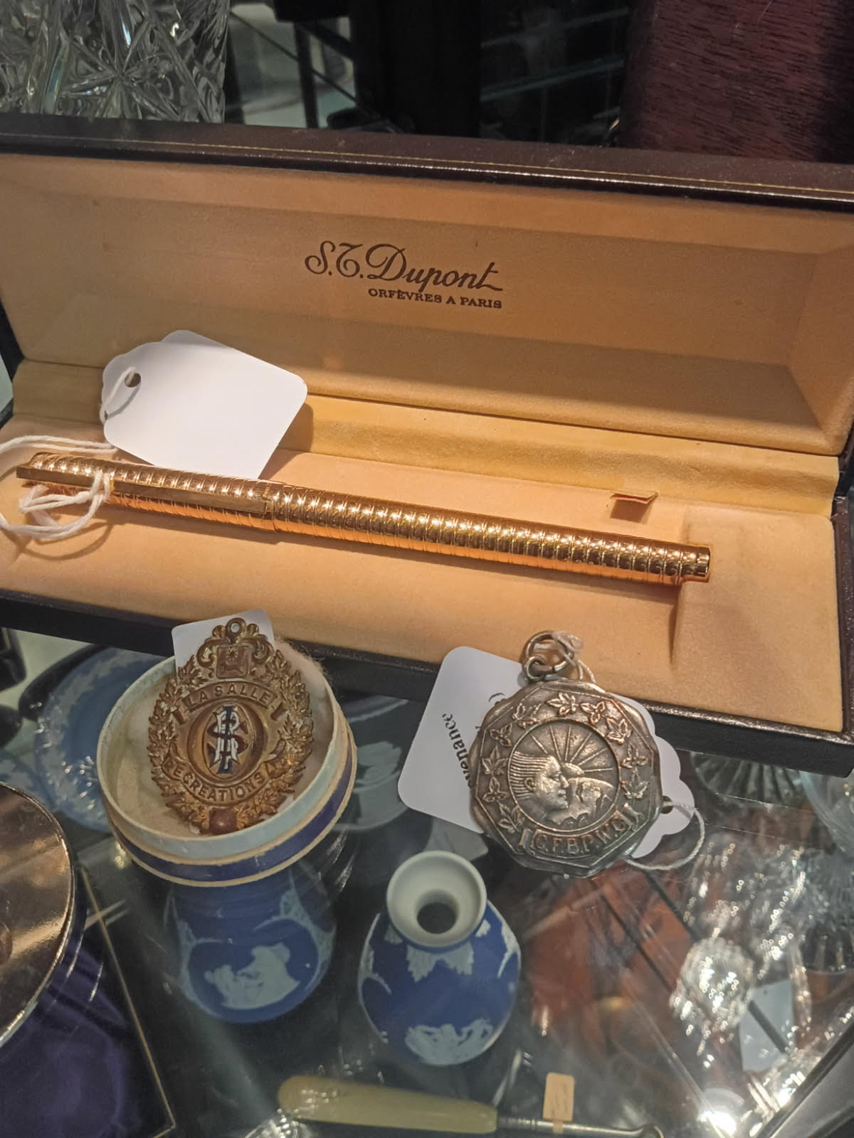
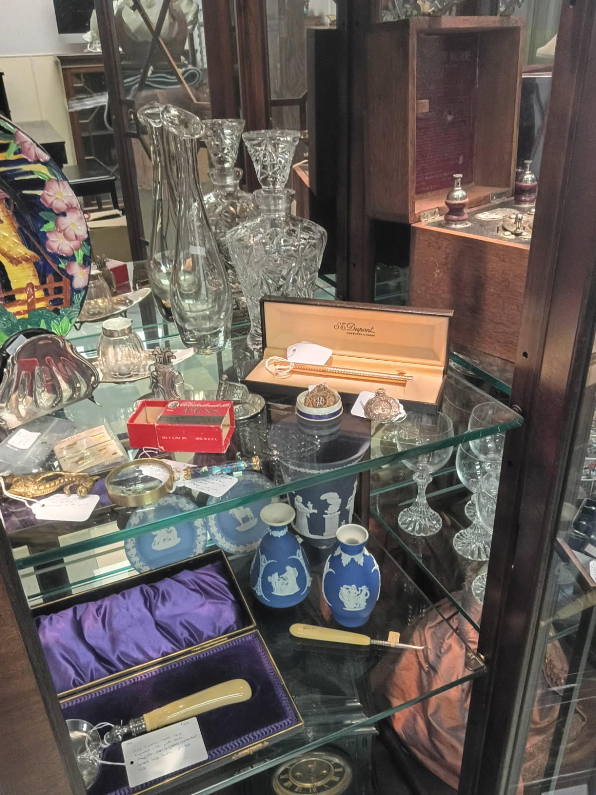
The shelf is a gentlemen’s affair. An S.T. Dupont pen lying in its Paris box. Cut crystal. An inkwell. Pocket watches. A little brass crest from La Salle. It is the sort of collection a certain kind of man assembles on a certain kind of desk, and it photographs beautifully.

And tucked right in the middle of all that masculine ceremony is a small, dark, worn-out disc about the size of a nickel-and-a-half, that I put there entirely on purpose.

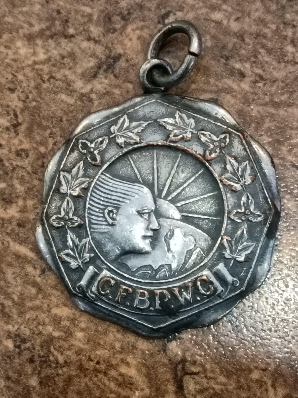
It is a medal. Silver plated — and I’ll be honest with you, the plating has given up in places and worn through to the copper underneath, with a few green freckles of age where the two metals have been arguing for ninety years. It is not valuable the way the Dupont is valuable. You could hold it and think well, that’s seen better days, and set it back down, and I would not blame you.

But turn it over and squint. The maker’s mark reads J.R. Gaunt — a British firm that stamped out cap badges and club medals by the barrowful, with a hand in Montreal. (The McCord Museum in Montreal has drawers full of the work, if you’d like to fall down that particular hole — I’ll wait here.) So half the regimental badges and society fobs in this country passed through their dies. And the front, under a little rising sun with maple leaves and Ontario trilliums around the edge, carries six initials: C.F.B.P.W.C.

The Canadian Federation of Business and Professional Women’s Clubs.Founded in 1930 — which drops them into the long quiet between the first wave of the women’s movement and the second. (They’re still going, by the way.) Working women — at a time when the phrase itself was still an argument — banding together for equal pay and a seat at the table, decades before that fight had a tidy name. The style of the thing says 1930s or ’40s to me, which puts it right at the founding. So while all those gentlemen’s objects were sitting on their desks being important, this is what the women were doing.

I don’t know whose it was. Somebody earned it, or was given it, or wore it to the meetings where the resolutions got written. I like to think she’d be quietly pleased to find herself here — the one working woman in a case full of men’s things, not asking permission, just in the room. Seemed to me exactly where she belonged.

She’s not for sale to the first person through the door. But if you ask to see the back room, and you pick her up, and you turn her over — well. We’ll have something to talk about.

Leslie
778-708-0454

The Pound & the Provenance
7791 Steveston Highway
(northwest corner of No. 3 Road and Steveston Highway)
Richmond, BC, Canada

~~~

Please Note: I am not an appraiser, a silversmith or a gemologist. I am an antiques dealer. A generalist with a love for things with a bit of age. I had a stroke, four years ago, and AI is helping me to do better than I would have. Nothing here is false, everything here is true. I hope you enjoy it and please leave a message.

Ref. no. 1191


Something unusual came through the door this week.

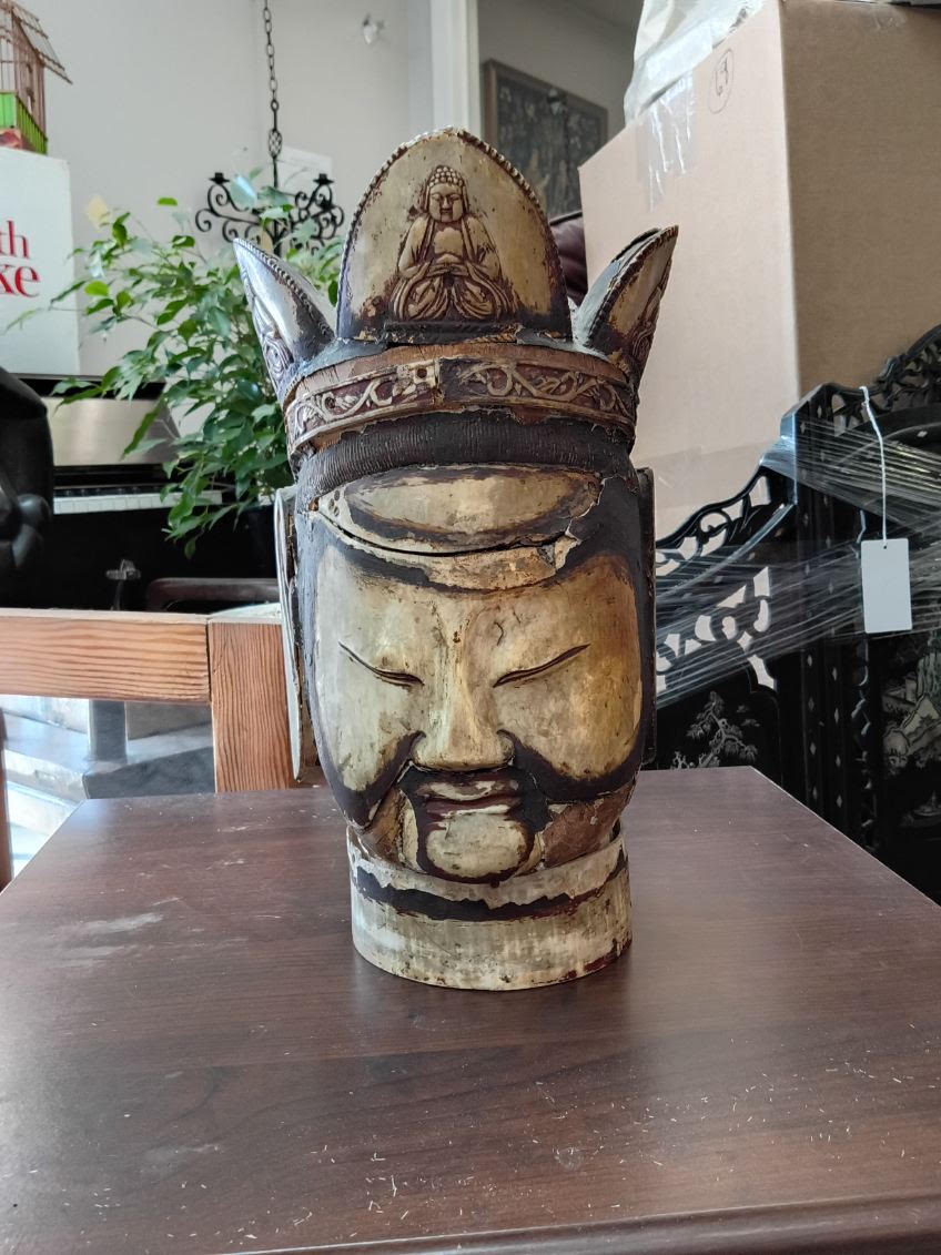
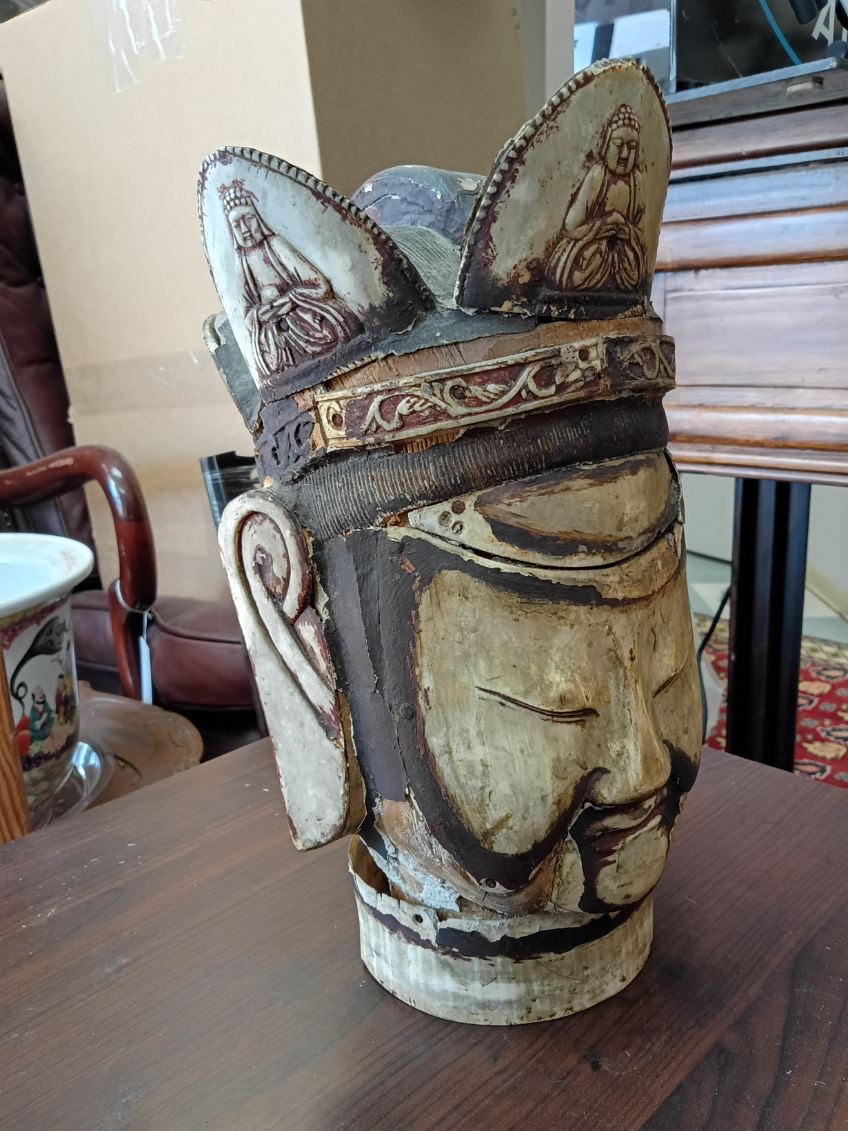
A carved temple head of a crowned deity — most likely Guanyin — clad in worked buffalo horn over a carved wood core, with finely incised detail across the crown and a row of tiny meditating Buddhas set into the flaming lotus petals across the front. The face still carries its old polychrome, softened by age and a little smoke.

What makes this one a curiosity: it has small sealed compartments, still closed, that in temple figures like this often held consecration deposits — prayers, texts, grains. To my knowledge, they’ve never been opened, and they’ll stay that way.

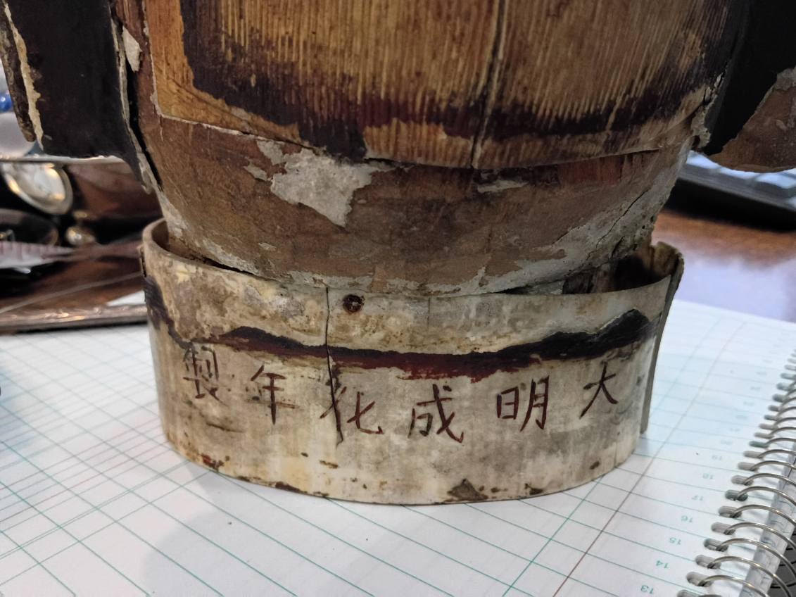
Around the base is a Chenghua reign mark (明成化年製). Such marks are almost always later homages to an admired era rather than a literal date — so it tells us the tradition the piece honours, not its birthday.

Honest age and honest wear — the horn cladding is lifting away in places where the old gesso bedding has let go over the years. We’re not cleaning or restoring it; it’s lovely as it is.

In-store in Richmond. Message or call to view — happy to walk you through it.

Leslie
778-708-0454

The Pound & the Provenance
7791 Steveston Highway
(northwest corner of No. 3 Road and Steveston Highway)
Richmond, BC, Canada

~~~

Please Note: I am not an appraiser, a silversmith or a gemologist. I am an antiques dealer. A generalist with a love for things with a bit of age. I had a stroke, four years ago, and AI is helping me to do better than I would have. Nothing here is false, everything here is true. I hope you enjoy it and please leave a message.

Ref. no. 1077

El Niño or La Niña

El Niño, the warm phase of ENSO (El Niño – Southern Oscillation weather pattern).

La Niña, the opposite of El Niño. The cold phase.

Oscillation, a repetitive back and forth at a regular interval.

We emerged from a very long run of El Niño which was followed closely by an ENSO-neutral (neither El Niño nor La Niña) period. Here in South Western Canada this means that last winter did not get that cold and it seemed to be a fairly short winter (in my memory anyway). The weather forecasters are now telling us that there is a very good chance that La Niña could bring a very cold winter.

El Niño and La Niña are normal weather patterns that fluctuate back and forth over the years and decades. They are much more predictable than the political adversaries they are blamed on and basically, what we need to do, is pay attention and dress for the occasion!

~~~

A little light reading on the subject (perfect for a chilly, smoky September afternoon):

Collins, M. El Niño- or La Niña-like climate change?. Clim Dyn 24, 89–104 (2005). https://doi.org/10.1007/s00382-004-0478-x

  • This article is not available for free but has some excellent links to the references that Professor Matthew Collins cites.

William S. (Billy) Brown. History of Los Padres National Forest, 1898-1945

William S. (Billy) Brown worked with the US Forest Service for 35 years, retiring in 1945. There is more of his writing out there and I will be keeping an eye open for it!

~~~~~

Brown, William S. (Billy). 1945. History of Los Padres National Forest: 1898-1945. Manuscript, Los Padres National Forest, Goleta, CA.

Blakley, Elwood Robert (Jim) and Karen Barnette. Historical Overview of Los Padres National Forest, 1985.

Elwood Robert (Jim) Blakley was a Grounds Superintendent at the Santa Barbara Botanic Garden. He collected plants, mainly herbs. He was a naturalist and an historian. Karen Barnette was a Cultural Resources Special with the Los Padres National Forest Service. Jim Blakley and Karen Barnette co-authored the paper, “Historical Overview of Los Padres National Forest, 1898-1945.”

This book is out of print but is available online. It follows the “History of Los Padres National Forest” written by William S. Brown in 1948.

~~~~~

Blakley, J.E., and K. Barnette. 1985. Historical overview of Los Padres National Forest. Los Padres Interpretive Association, Santa Barbara, California, USA.

Adams, Kramer: The Redwoods, 1969

The book, The Redwoods (published in 1969 by Popular Library), by Kramer Adams, is cited by Gregory Jones in his Masters Theses, Coast redwood fire history and land use in the Santa Cruz Mountains, California (2014, San Jose State University).

It looks like a fairly rare book with only a handful of copies showing up in my online searches.

~~~

Adams, Kramer. 1969. The Redwoods. Popular Library, New York, New York, USA.

Jones, Gregory. Coast redwood fire history and land use in the Santa Cruz Mountains, California. San Jose State University. 2014

I have read a bit and will go through Gregory Jones’s Master’s Theses, Coast redwood fire history and land use in the Santa Cruz Mountains, tonight.

If you are unfamiliar with reading a theses, start with the introduction and then, what I do, is to move through the pages between the Introduction and the Discussion fairly quickly. I find that discussion sections can be quite interesting and, if you need more information on something that is being ‘discussed’ – you can go back and the information is probably in those pages that you turned through quickly.

If I find more by Gregory Jones, I will add it here. If you have any comments or would like to discuss this paper, I would like to hear from you!

Here are the links you need to find this work:

~~~~~

Jones, Gregory.  San Jose State University.  Publications Link.

LeTourneau Land Train

54 Wheel Drive Electric Vehicle

TournaTrain.m4V

1950’s technology.  Developed by R.G. LeTourneau

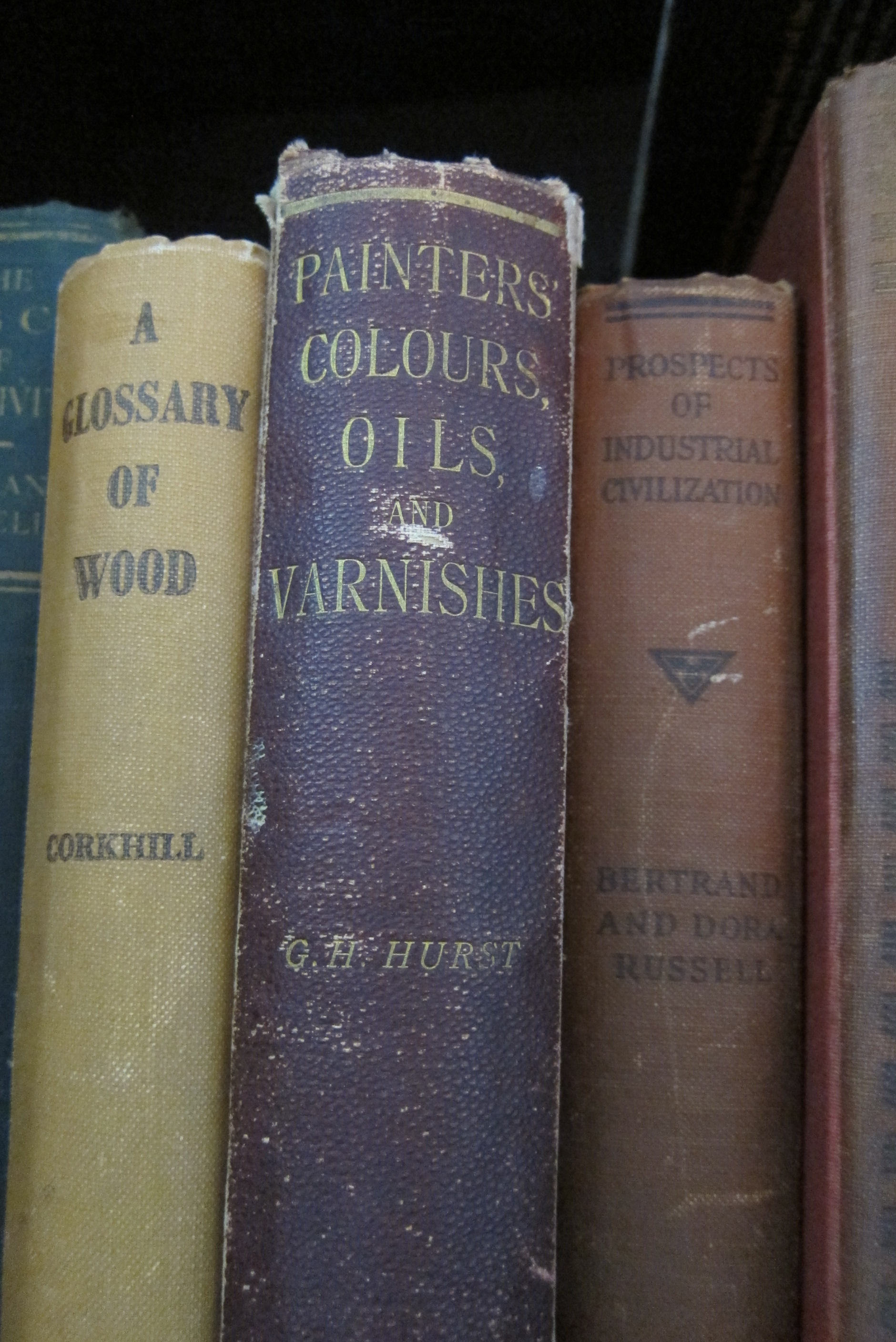
Painters’ Colours, Oils, and Varnishes: A Practical Manual by George H. Hurst, F.C.S. – published in 1892

Painters’ Colours, Oils, and Varnishes: A Practical Manual by George H. Hurst, F.C.S. Published in 1892 by Charles Griffin & Company, Limited, Exeter Street, Strand, London

I love this book and, I want to share some of what is in it, with links, so that the information can be used by artists and people doing various crafts.  The old information is fascinating and, coupled with what is available today – it is usable!  Be safe!  Be careful!  Most of this is not safe for children.  Please, always  keep safety in mind.

IMG_0088As I get going on this little project, I will add excerpts and links below.  Please feel free to comment, add and send links – the more information and the easier it becomes to find it, the better for everyone!

I am going to try to update this post regulary, with more excerpts and more links, as I work my way through this book!

~~~

Chapter I:  Introductory. Colour, Colours, Paints and Varnishes.

from page 4, “Cause of Colour in Coloured Bodies. — The actual reasons why bodies such as vermilion, magenta, or emerald green are coloured, it is almost impossible to investigate in the present state of knowledge, since the cause, whatever it may be, must be due to the molecular construction of the different compounds about which very little is known…”

  • Geology is the key word here.  Geologists have been working to increase our knowledge base of Earth in general and specifically, in this case, our knowledge of pigments. Here is a great place to read about colour, Dust to Dust:  A Geology of Color by Heidi Gustafson  –  if you like playing in the dirt, foraging for rocks and then doing something with them, Heidi Gustafson’s website has some great information in it!

from page 5, “Colour Theories. — Two theories of colour are in use to explain the coloured effects of light.  The old theory… Brewster… The more modern theory, first broached by Young and more fully developed by Helmholtz…”

  • Sir David Brewster’s (1871-1868) work on colour theory is from the 1830’s.  His work “On a new analysis of solar light” was written in 1831 and published by Charles Tait, and Bell & Bradfute; and T. Cadell, London.  One place I have found credit for Sir David Brewster’s theories on the perception of colour is in an article by Peter John Brownlee, “Color Theory and the Perception of Art“, published in 2009 by The University of Chicago Press Journals.
  • Thomas Young, M.D. (1773-1829), was a scientist studying human perception of colour and in 1802 wrote a treatise speculating on how the human eye works to perceive colour.  There is also a lecture series by Thomas Young, “A Course of Lectures on Natural Philosophy and the Mechanical Arts” which was published in London by Joseph Johson, St. Paul’s Church Yard, in 1807.
  • Hermann von Helmholtz (1821-1894), continued work on the development of Thomas Young’s theories of human colour perception.  This work is known as the “Young-Hemholtz Theory” and furthers Thomas Young’s theories as to how our eyes actually work to perceive color.
  • This body of knowledge has been expanded upon for more than the 250 years shown in these writings and continues to grow today.  Here are just a few examples of the psychology of colour perception that are a little more recent.

from page 6, “Colours. — … the term “colours” is used in two senses — first, to express the sensation which light of various kinds… excites on the retina of the eye, and which sensation is purely functional; second, … [the] imparting [of] colour to other bodies;  such bodies are known as colouring matters and may be divided into two groups, dyestuffs and pigments….”

  • sensations of light, through rather than on the retina, continue to be studied by the scientific and psychological communities today.  This is fascinating research and the McGovern Medical School at the University of Texas has some open access resources on this subject.
  • dyestuffs, as referred to by George Hurst, are materials which provide ‘soluable’ material that can be used to add colour to another item.  In other words, dyeing or staining, imparts temporary colour to other items.  If you have access to a copy of the Oxford English Dictionary, the definition and history of the word ‘dyestuff’ is fascinating.  Most libraries have a copy of the OED and may also allow access to the online version.
  • pigments, then, as defined by George Hurst in 1892, are ‘nonsoluable’ materials which provide a more permanent, opaque colour to things like paint.  Most of the chapters in this book are about pigments, where to find them, what to find them in, how to extract them and, how to use them.

~~~

Chapter II:  White Pigments

Chapter III:  Red Pigments

Chapter IV:  Yellow and Orange Pigments

Chapter V:  Green Pigments

Chapter VI:  Blue Pigments

Chapter VI:  Brown Pigments

Chapter VII:  Black Pigments

Chapter IX:  Lakes

Chapter X:  Assay and Analysis of Pigments

Chapter XI:  Colour and Paint Machinery

Chapter XII:  Paint Vehicles

Chapter XIII:  Driers

Chapter XIV:  Varnishes

~~~~

A related post, and… a very interesting one!

Colour Theory from 1882

book cover   title page

The link takes you to a high resolution copy of this amazing 800+ page book.