Category Archives: Colour Theory

A Little Tag, A Lot of Silver Plate

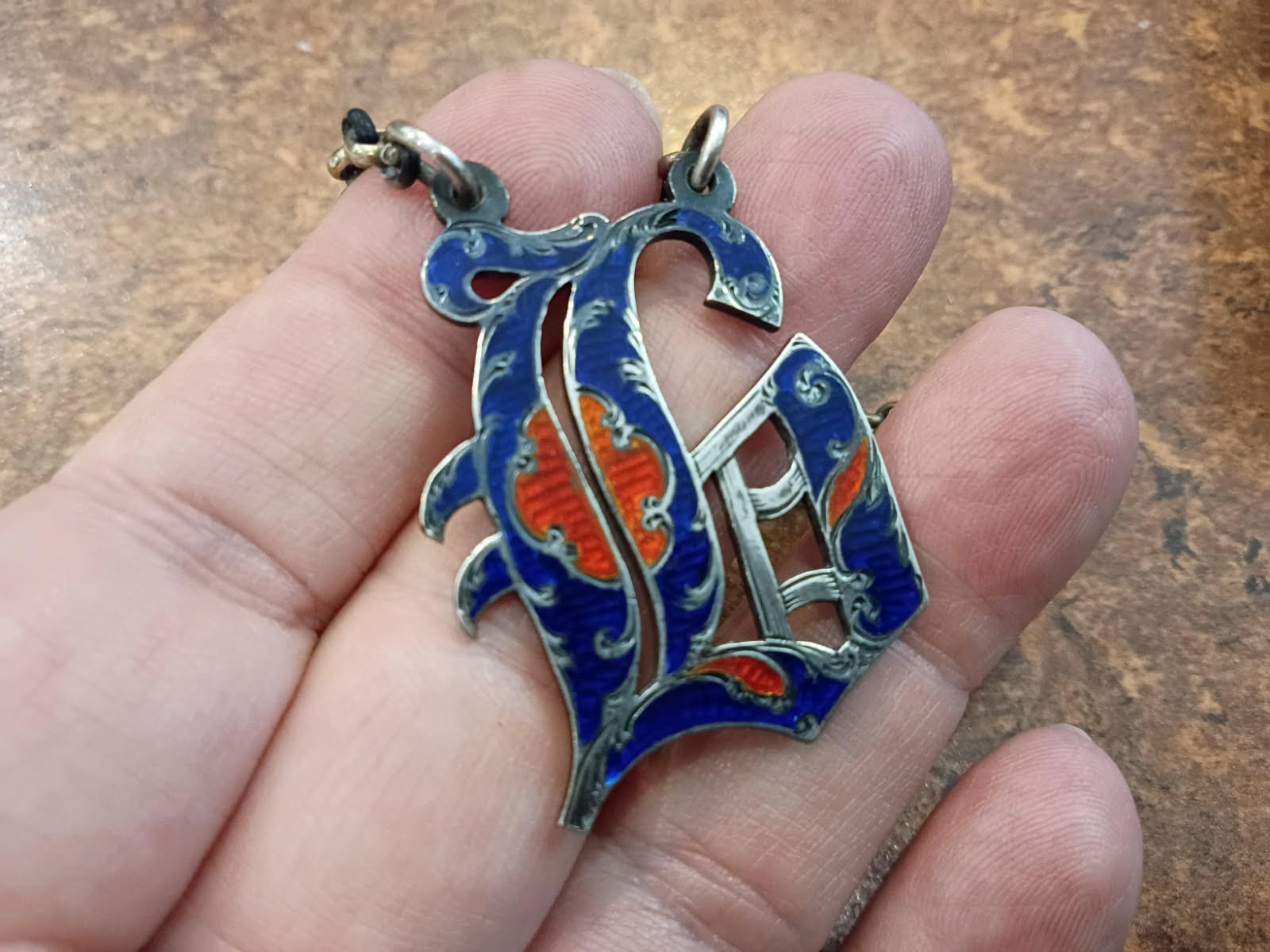
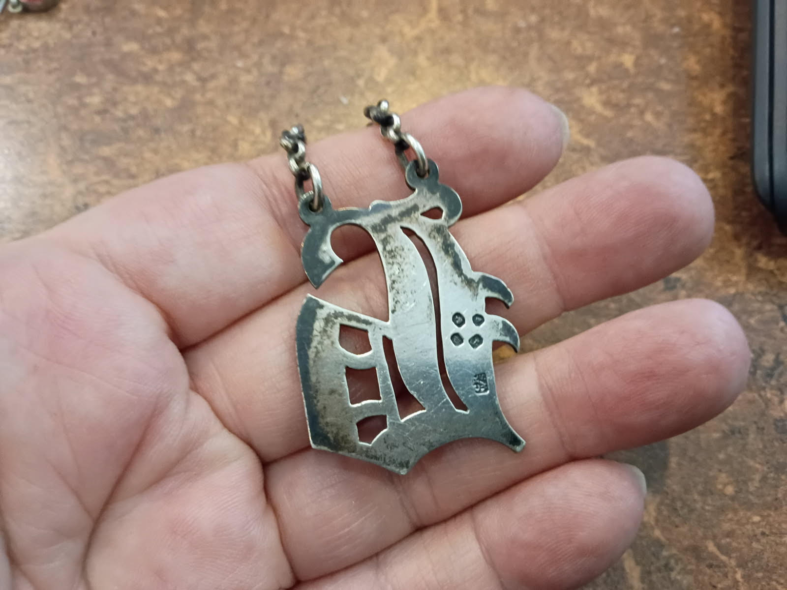
This little tag came in among a lot of silverplate — tarnished black, easy to walk past, with what looked like a fancy letter on the front. A proper look under the loupe, and a little light polishing, told a very different story.

It’s a sterling silver wine label — the kind that once hung by a fine chain around the neck of a decanter, so a host could tell the Claret from the Port without pulling every stopper. This one is the letter “C,” for Claret — but in black-letter, the old Gothic script, which is why it looks so unlike the plain C we write today. The hallmarks date it to the year: London, 1848 — early Victorian, Queen Victoria on the throne eleven years — made by Charles Rawlings & William Summers, a London firm known for exactly this kind of small, fine silver.

Now, the colour — because this is the part worth slowing down for.

It isn’t paint, and it isn’t a coloured stone. It’s enamel, which is powdered glass fused to metal in a kiln. But it’s a particular, harder kind called basse-taille (French for “low-cut”), and here’s the trick of it: before any glass goes on, the silversmith hand-engraves the silver underneath in a fine, wave-like pattern. Then translucent red and blue enamel is laid over that engraving and fired. Because the glass is see-through, light passes down through the colour, catches the engraved silver beneath, and bounces back up — so the piece doesn’t just sit there flat, it glows and shifts as it moves. Every wave you can see under the red is a cut made by hand, one at a time, on a piece less than half the size of a business card.

It’s slow, exacting work with no margin for a slip — the enamel either comes out of the kiln clean or it cracks and you start over. Which makes the condition of this one quietly remarkable: 178 years, and not a single chip.

A small thing, a lovely thing — and older than the province it now sits in. (British Columbia joined Confederation in 1871. This label already had a 23-year head start.)

And that’s rather the point. This nearly went out with the plate. So before the next houseful of “old junk” heads for the curb — before you hand the boxes to the fellow with the truck — give the small, dark, unglamorous things a slow look. The tag nobody can read. The dented little spoon. The thing that “can’t be worth anything.” That’s exactly where the good stuff hides, and once it’s gone in a bulk lot, it’s gone for good. If a piece has you puzzled, bring it in and we’ll look at it together. No charge to wonder.

Leslie
778-708-0454

The Pound & the Provenance
7791 Steveston Highway
(northwest corner of No. 3 Road and Steveston Highway)
Richmond, BC, Canada

~~~

Please Note: I am not an appraiser, a seamstress, a silversmith, or a gemologist. I am an antiques dealer. A generalist with a love for things with a bit of age. I had a stroke, four years ago, and AI is helping me to do better than I would have. Nothing here is false, everything here is true. I hope you enjoy it and please leave a message.

Ref. no. 1075

50% Off Everything You can Wear – This Week Only

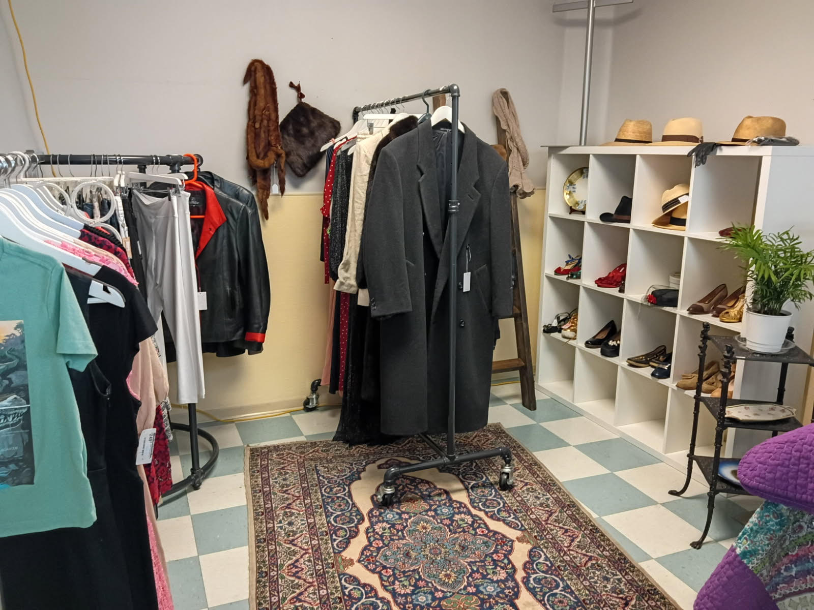
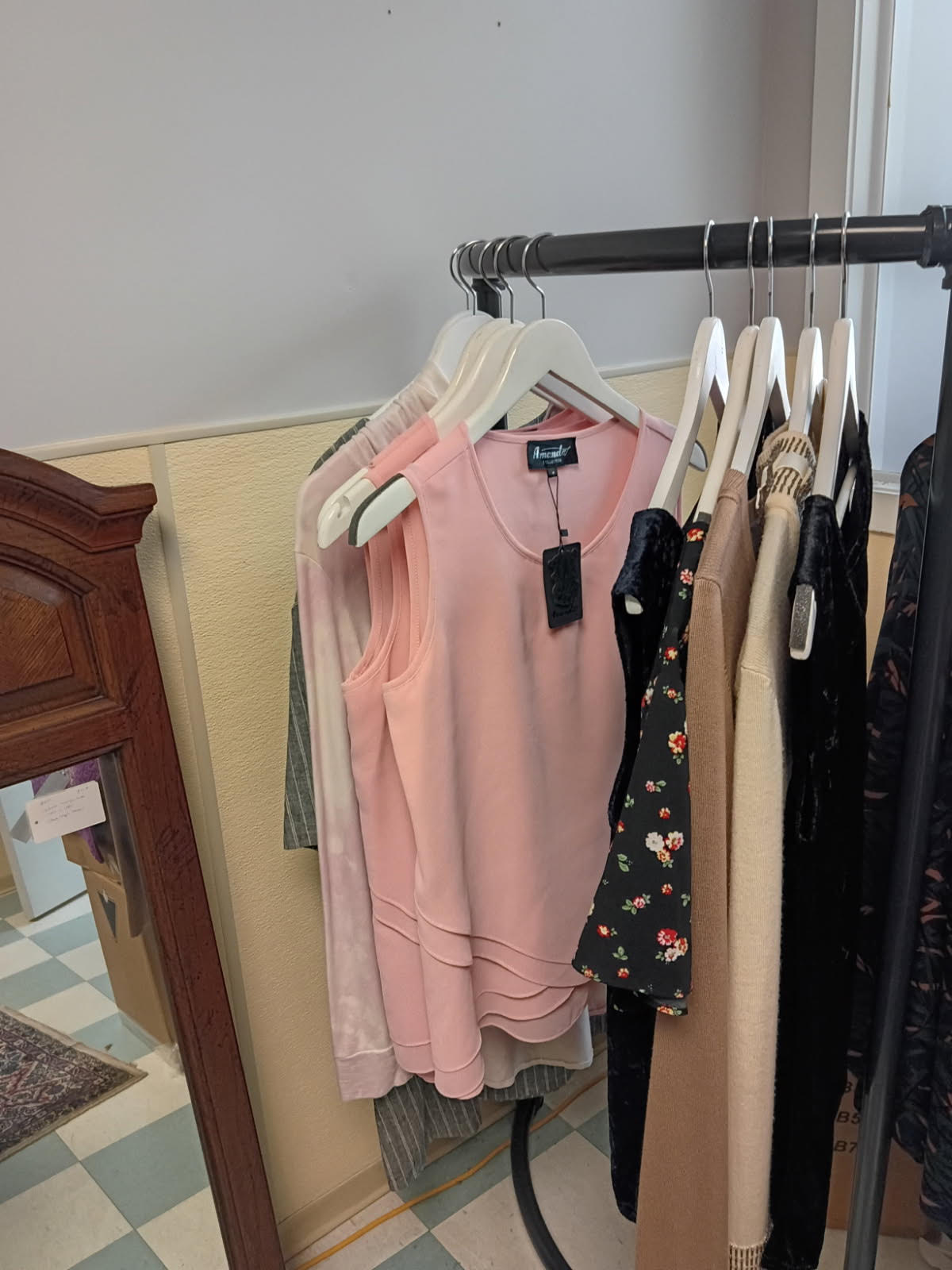
The seasons are turning, and I’m making room. So everything in the shop you can wear is going out at half price.

It’s a small room, about the size of a walk-in closet, but it’s packed — and I’ll be filling in the spaces all week long, adding new things as they come. So it’s worth more than one visit; what isn’t there Saturday may well be there Wednesday.

The details:
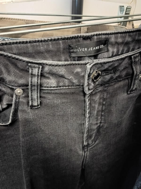
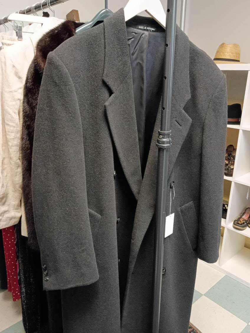
50% off all clothing, accessories, shoes, hats, coats, jackets and furs — every tag
(Sorry, jewelry is not included in this sale – but we always think carefully about offers!)

Saturday, September 19 through Saturday, September 26, 2026
Open 10:30 am to 5:30 pm
In-store only, at the shop

Starting tomorrow, 50% off every Clothing Tag — all the clothing, the coats and jackets, the leathers, the dresses, the denim, the shoes, the hats, the accessories, and the furs. Yes, the furs too — including a 1970s Hudson’s Bay mink that’s been waiting for the right person.

Can’t make those hours? Give me a call and we’ll arrange a private time — before or after opening — just for you. A quiet browse with the room to yourself.

Come dig. Half the fun is finding the thing you didn’t know you were looking for.

Leslie
778-708-0454

The Pound & the Provenance
7791 Steveston Highway
(northwest corner of No. 3 Road and Steveston Highway)
Richmond, BC, Canada

~~~

Please Note: I am not an appraiser, a silversmith or a gemologist. I am an antiques dealer. A generalist with a love for things with a bit of age. I had a stroke, four years ago, and AI is helping me to write better than I would have. Nothing here is false, everything here is true. I hope you enjoy it and please leave a message.

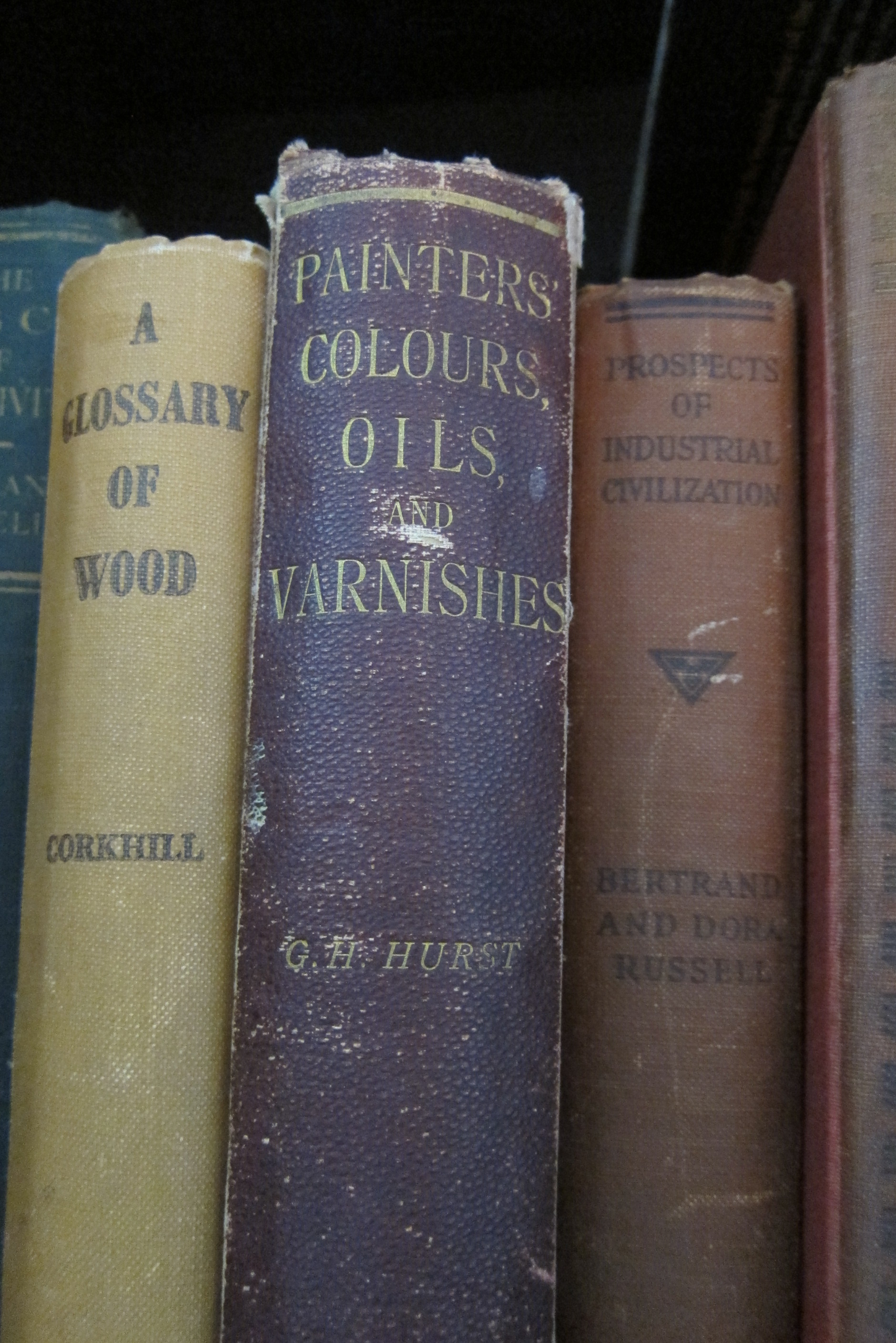
Painters’ Colours, Oils, and Varnishes: A Practical Manual by George H. Hurst, F.C.S. – published in 1892

Painters’ Colours, Oils, and Varnishes: A Practical Manual by George H. Hurst, F.C.S. Published in 1892 by Charles Griffin & Company, Limited, Exeter Street, Strand, London

I love this book and, I want to share some of what is in it, with links, so that the information can be used by artists and people doing various crafts.  The old information is fascinating and, coupled with what is available today – it is usable!  Be safe!  Be careful!  Most of this is not safe for children.  Please, always  keep safety in mind.

IMG_0088As I get going on this little project, I will add excerpts and links below.  Please feel free to comment, add and send links – the more information and the easier it becomes to find it, the better for everyone!

I am going to try to update this post regulary, with more excerpts and more links, as I work my way through this book!

~~~

Chapter I:  Introductory. Colour, Colours, Paints and Varnishes.

from page 4, “Cause of Colour in Coloured Bodies. — The actual reasons why bodies such as vermilion, magenta, or emerald green are coloured, it is almost impossible to investigate in the present state of knowledge, since the cause, whatever it may be, must be due to the molecular construction of the different compounds about which very little is known…”

  • Geology is the key word here.  Geologists have been working to increase our knowledge base of Earth in general and specifically, in this case, our knowledge of pigments. Here is a great place to read about colour, Dust to Dust:  A Geology of Color by Heidi Gustafson  –  if you like playing in the dirt, foraging for rocks and then doing something with them, Heidi Gustafson’s website has some great information in it!

from page 5, “Colour Theories. — Two theories of colour are in use to explain the coloured effects of light.  The old theory… Brewster… The more modern theory, first broached by Young and more fully developed by Helmholtz…”

  • Sir David Brewster’s (1871-1868) work on colour theory is from the 1830’s.  His work “On a new analysis of solar light” was written in 1831 and published by Charles Tait, and Bell & Bradfute; and T. Cadell, London.  One place I have found credit for Sir David Brewster’s theories on the perception of colour is in an article by Peter John Brownlee, “Color Theory and the Perception of Art“, published in 2009 by The University of Chicago Press Journals.
  • Thomas Young, M.D. (1773-1829), was a scientist studying human perception of colour and in 1802 wrote a treatise speculating on how the human eye works to perceive colour.  There is also a lecture series by Thomas Young, “A Course of Lectures on Natural Philosophy and the Mechanical Arts” which was published in London by Joseph Johson, St. Paul’s Church Yard, in 1807.
  • Hermann von Helmholtz (1821-1894), continued work on the development of Thomas Young’s theories of human colour perception.  This work is known as the “Young-Hemholtz Theory” and furthers Thomas Young’s theories as to how our eyes actually work to perceive color.
  • This body of knowledge has been expanded upon for more than the 250 years shown in these writings and continues to grow today.  Here are just a few examples of the psychology of colour perception that are a little more recent.

from page 6, “Colours. — … the term “colours” is used in two senses — first, to express the sensation which light of various kinds… excites on the retina of the eye, and which sensation is purely functional; second, … [the] imparting [of] colour to other bodies;  such bodies are known as colouring matters and may be divided into two groups, dyestuffs and pigments….”

  • sensations of light, through rather than on the retina, continue to be studied by the scientific and psychological communities today.  This is fascinating research and the McGovern Medical School at the University of Texas has some open access resources on this subject.
  • dyestuffs, as referred to by George Hurst, are materials which provide ‘soluable’ material that can be used to add colour to another item.  In other words, dyeing or staining, imparts temporary colour to other items.  If you have access to a copy of the Oxford English Dictionary, the definition and history of the word ‘dyestuff’ is fascinating.  Most libraries have a copy of the OED and may also allow access to the online version.
  • pigments, then, as defined by George Hurst in 1892, are ‘nonsoluable’ materials which provide a more permanent, opaque colour to things like paint.  Most of the chapters in this book are about pigments, where to find them, what to find them in, how to extract them and, how to use them.

~~~

Chapter II:  White Pigments

Chapter III:  Red Pigments

Chapter IV:  Yellow and Orange Pigments

Chapter V:  Green Pigments

Chapter VI:  Blue Pigments

Chapter VI:  Brown Pigments

Chapter VII:  Black Pigments

Chapter IX:  Lakes

Chapter X:  Assay and Analysis of Pigments

Chapter XI:  Colour and Paint Machinery

Chapter XII:  Paint Vehicles

Chapter XIII:  Driers

Chapter XIV:  Varnishes

~~~~

A related post, and… a very interesting one!

Colour Theory from 1882

book cover   title page

The link takes you to a high resolution copy of this amazing 800+ page book.